Tuesday, December 17, 2013

Rams, vintage-inspired

The St. Louis Rams are reportedly going to pull the trigger on a uniform overhaul in the near future, likely 2015 or 2016, and much to my annoyance, their owners are hinting towards at least a throwback to these:
bestsportsphotos.com

Purely on an aesthetic basis, I've never liked the Fearsome Foursome set.  I much prefer their 50s golds:
wikipedia.com

Santa Cruz Warriors #2 and #3

One of the things that I feel makes the Golden State Warriors' "The City" uniform what it is, is the cable car on the back, upon which the numbers were located.

Santa Cruz aint exactly known for having cable cars, though.  I tried to play things straight, though, which had led to the contrasting surfboards.  Turns out, most of the comments at Creamer's basically liked the rest of the uniform, they just weren't high on the back, so I made a couple more goes at it.  First, a single board closer in color to the jersey, the idea there being similar to that little oval the Suns had their front number over until this season.


The other idea I floated out there was basically identical to the white alt, with a board as a nameplate.

Calgary Flames

A few weeks back, the Calgary Flames unveiled their new third jersey, which looks alright IMO, but the only part about it that I feel was a home run was the shoulder crest.  Getting a look at some of the rejected logos made me think the Flames missed an opportunity here, but as they say, one man's trash is another man's treasure, and the simplified burning C that was in the reject pile caught my eye.

Wednesday, November 27, 2013

Boston Red Sox: Generations, or alts as slightly alternate history

A while back, maybe a year or two ago, I got to thinking about alt history concepts.  They've been done, but not that often, but somehow, someway I wound up in that exact territory, wondering what alts I could come up with for various time periods.  In every case, the images said it all.  These were originally posted at CCSLC in 2011.

Mighty Fighting Sea Dubs...Santa Cruz Warriors part 1

Ask a basketball fan who doesn't particularly care about uniforms what an iconic uniform looks like, and he'll probably point to the Celtics green the Lakers' gold or the Bulls red.  Ask a uniform fanatic, you'll probably get those three as well.  You'll also get a fourth option: The City.
courtesy warriorsrundown.blogspot.com
This post is about the Warriors.  No, not the Golden State Warriors.

Tuesday, November 26, 2013

Milwaukee Bucks MECCA third

The Milwaukee Bucks had announced over the summer that they were replacing their rather generic floor with a more distinct hardwood patterned after the old MECCA floor.  In what is such a Bucks thing to happen, however, the only preseason game they tried to play on it was called midway into the first quarter, as the floor wound up being too slick.

In any event, I'd found myself wondering what it'd look like in jersey form, and here it is.
I might have been better served making the numbers white, but oh well.

College to Pro: Russell Wilson

Most of the NFL's star players spent their college careers at one place.  A decent number of others spent time at junior colleges, then transferred to a four year school.  Then there are the rare cases of guys who transferred for one reason or another, such as Russell Wilson.
courtesy seattlepi.com
Though NC State was still wearing the Falcons ripoffs when he first got there, at the end of his time there, the Wolfpack was wearing much plainer fare.  Likewise, Wisconsin hasn't made any major changes to their uniform for a couple decades.  The contrast of both styles with that of the Seahawks' avant garde set was too amusing to pass up.  Hell, in this case I figured the hawk head alone wouldn't be enough, so I worked it into a passable S, then made a left-side version to avoid the "badge of cowardice" that would result.  For NCSU, I brought the 90s wolfpack heads out of retirement, figuring they'd be a good substitute for the wraparound hawk head.  Finally, wolf tails are on NC State's pants.


I recall having a cap with a snarling badger on it in the early or mid 90s, though that logo is rather hard to find.  As I didn't particularly like it anyway, I went with Bucky over a red/black wraparound stripe.  The W's on the pants stripe is a concession to the fact that I couldn't find the paw print I'd originally intended to use.

Chicago Cubs

I know one thing, if I were a betting man, I'd always put money on being able to spot someone in a given Wrigley Field crowd wearing a cap like this (hell, likely every third or fourth fan):
courtesy strictlyfitteds.com

Arizona Cardinals

One thing I like doing in football concepts is modifying traditional elements in some way, and few things scream "traditional football" like Northwestern stripes (the thin-thick-thin stripes worn by the Steelers, Lions, Iowa, BYU, and namesake Northwestern, among many others).  Back in the late 90s, ESPN started airing Arena league games live, and among the AFL's top teams were the Arizona Rattlers and San Jose Sabercats, both of whom utilized Northwestern stripes in what remain the most distinctive manners I've seen, SMU's use of them on their shoulders notwithstanding.  The middle stripe on the Rattlers' sleeves was a turquoise/copper diamondback pattern, much like the Diamondbacks would later utilize, while a sunburst graced the Sabercats' uniform.
Arizona Rattlers courtesy azcentral.com

Saturday, June 29, 2013

A little bit Aussie

Several years back, FS Wisconsin would show an AFL highlight show at 5 pm or so (unless the Brewers were playing out east), and I fell in love with the game after I happened to tune in one week.  Unfortunately, FSW no longer airs the show, but I've been posting many an Aussie footy concept ever since.  Here's some of my fare, some recent, some not so much.

First, the only actual club among this batch, the Queanbeyan Tigers, who hail from New South Wales but are far closer to Canberra than Sydney, and thus usually play in Canberra-centric leagues.  Like many "Tigers" in Aus, in real life they usually wear black jumpers with a gold sash, which is worn by the Richmond Tigers of the AFL, so here I decided on a couple different takes on it.  The one-off, the sash over black and white stripes, is a throwback to the 50s, when Queanbeyan merged with another club, nearby Acton FC, which was popularly known as "the Combine," and had been wildly successful, making it to the grand final every year of the merger (which ceased due to...wait for it...money.  Queanbeyan was supplying most of the players, but Acton was taking in most of the money.)

Friday, June 28, 2013

College to Pro: Charles Woodson, Randy Moss, Adrian Peterson

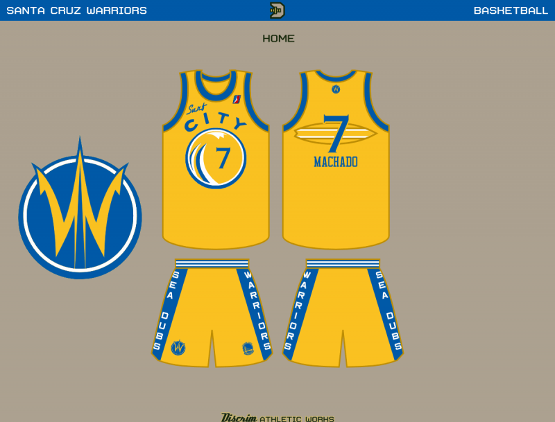
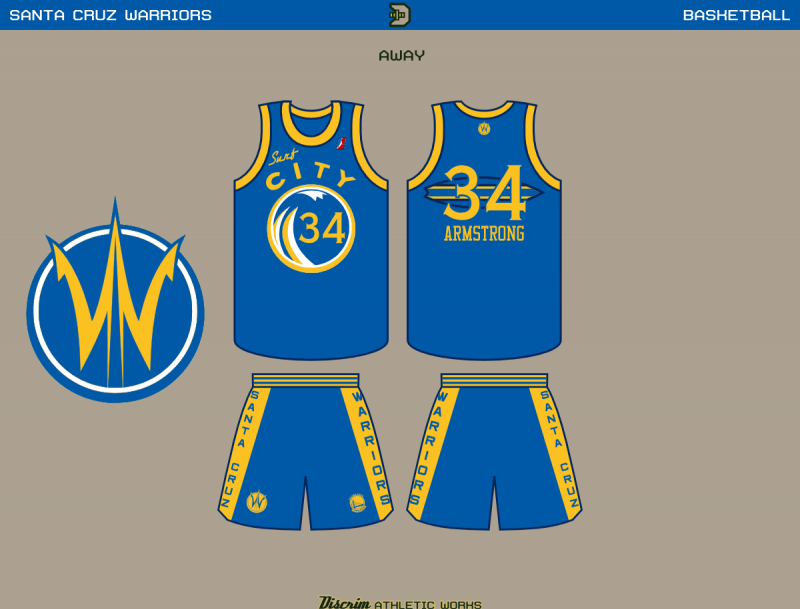
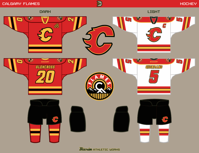
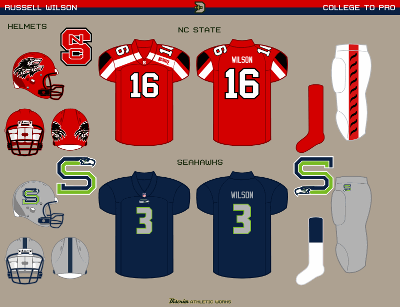
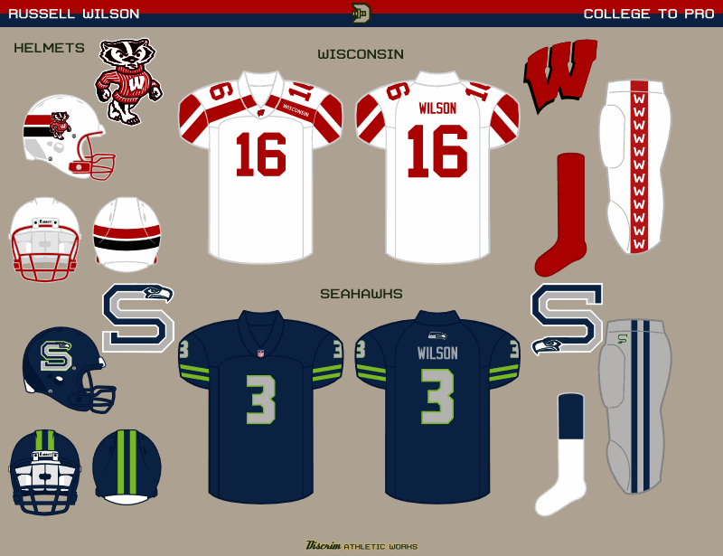
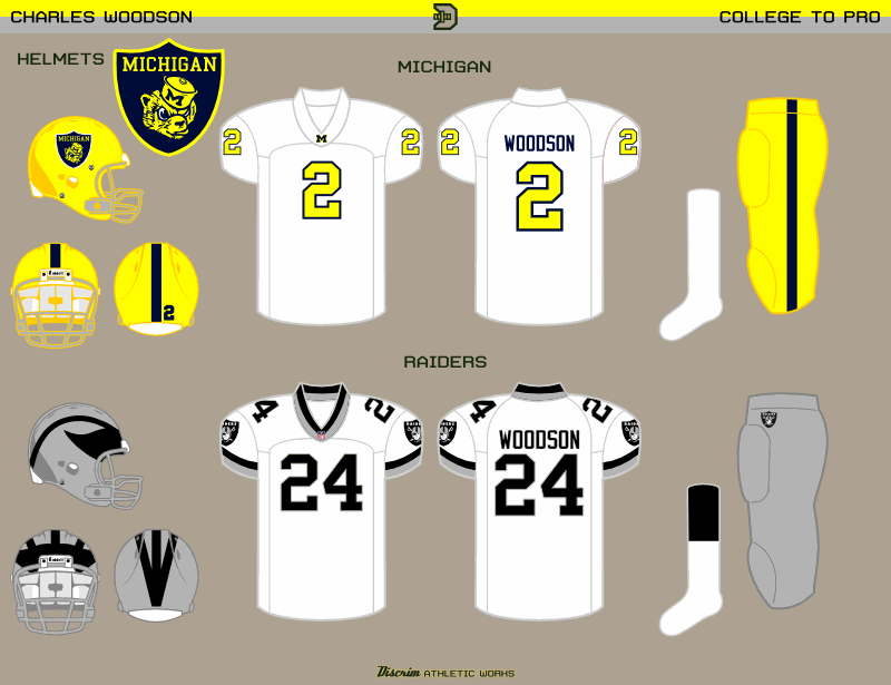
A few years back, probably even before then, I'd occasionally wondered what pro players' college and pro uniforms would look like if their overall styles, for lack of better terms, were flipped with each other.  That, in essence, is the idea behind an off-and-on series I like to call "College to Pro."  I've been posting sets of these for a few years now at the Sportslogos.net boards, so this aint my first rodeo, just my most recent.  First up, my newest C2P concepts: Charles Woodson, commemorating his return to Oakland.

Whenever a C2P set features the Raiders as the NFL team, I've thrown together a mock Raider shield, and Michigan is no exception, though I had to do a bit of diggng for the wolverine head I used, otherwise I was ready to go with the M.  And in all honesty, the numbers could just as easily have been blue instead of maize, so you can take it as a bit of artistic license on my part.  On the Raiders side, the jersey is modeled after the late 90s Michigan road white, with silver and black replacing maize and blue, naturally, and the Raider shield replacing the M's on the sleeves. 

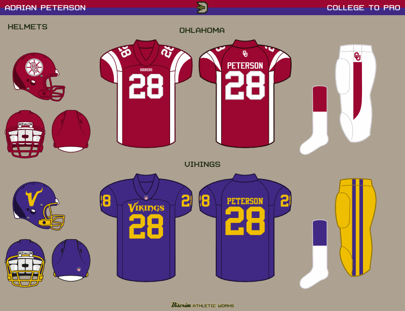
A few months earlier, I'd posted a little Vikings two-step in the form of Adrian Peterson and Randy Moss.  As I've found myself saying more frequently than I do with normal concepts, some things happen, most often it'll be an issue that prevents a true swap, for instance the Vikings having their famed horns, but Oklahoma not really having anything horizontal that'd look good on a helmet (I'm sorry, that stagecoach is just ugly).  Thus, the Boston Bruins ripoff meant to evoke a wagon wheel.  The OU jersey is based on the recently-retired Vikings uniform, and as you can see, I had a much easier go of it making the Vikes resemble the Sooners.

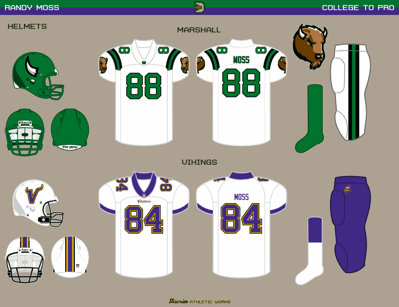
Now we got Randy Moss...and I'll tell ya what, I got childhood memories of the 1-AA championship game, of Marshall and Youngstown State duking it out, and later on, the other Adrian Peterson and Georgia Southern dominating.  Fortunately for what I had in mind, Marshall's mascot is a bison (what "Thundering Herd" alludes to).  Which has horns.  And would be based on the Moss-era Vikings uniform, which they never should've abandoned.  Granted, the bison logos Marshall uses now were adopted several years into Moss' NFL career, but there are times you gotta make excpetions.  In a C2P context, I ended up calling such a case the Woodson Exception, oddly enough.  The Vikings uni here, honestly, was destined to be overshadowed through no real fault of its own, merely due to Marshall's uniforms being pretty basic.

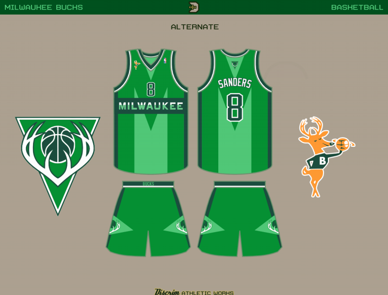
Have a good weekend, and be thankful you aren't a Bucks fan.  Getting swept by the Heat aint progress, no matter what Kohl thinks.

Friday, April 12, 2013

Army Black Knights...oh, and welcome to Discrim Concepts

Welcome to Discrim Athletic Concepts, the name's Anthony, though the good folks at Chris Creamer's Sports Logo Community know me better as Discrimihater.  Don't ask about the name, the story behind it's rather boring and I don't remember all of it clearly.  Anyways, I've been designing uniform concepts as something of a hobby since 2001, and have been interested in sports uniforms long before then.  Main reason I don't call myself a graphic designer, really, is mainly my lack of interest in business design, combined with not even being close to the best artist in my family.

Anyway, my life story aint what you came for, is it?