Tuesday, December 17, 2013

Rams, vintage-inspired

The St. Louis Rams are reportedly going to pull the trigger on a uniform overhaul in the near future, likely 2015 or 2016, and much to my annoyance, their owners are hinting towards at least a throwback to these:
bestsportsphotos.com

Purely on an aesthetic basis, I've never liked the Fearsome Foursome set.  I much prefer their 50s golds:
wikipedia.com

Santa Cruz Warriors #2 and #3

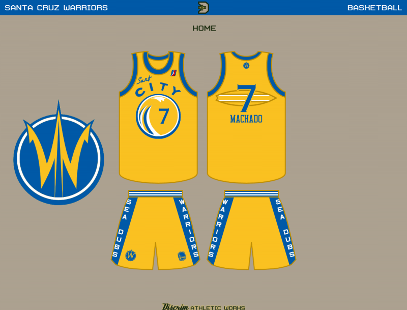
One of the things that I feel makes the Golden State Warriors' "The City" uniform what it is, is the cable car on the back, upon which the numbers were located.

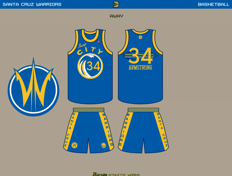
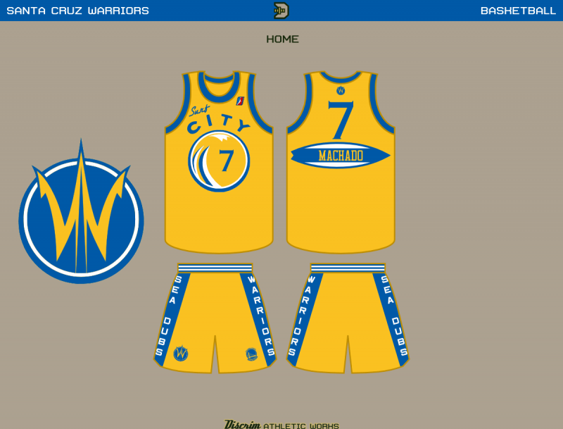
Santa Cruz aint exactly known for having cable cars, though.  I tried to play things straight, though, which had led to the contrasting surfboards.  Turns out, most of the comments at Creamer's basically liked the rest of the uniform, they just weren't high on the back, so I made a couple more goes at it.  First, a single board closer in color to the jersey, the idea there being similar to that little oval the Suns had their front number over until this season.


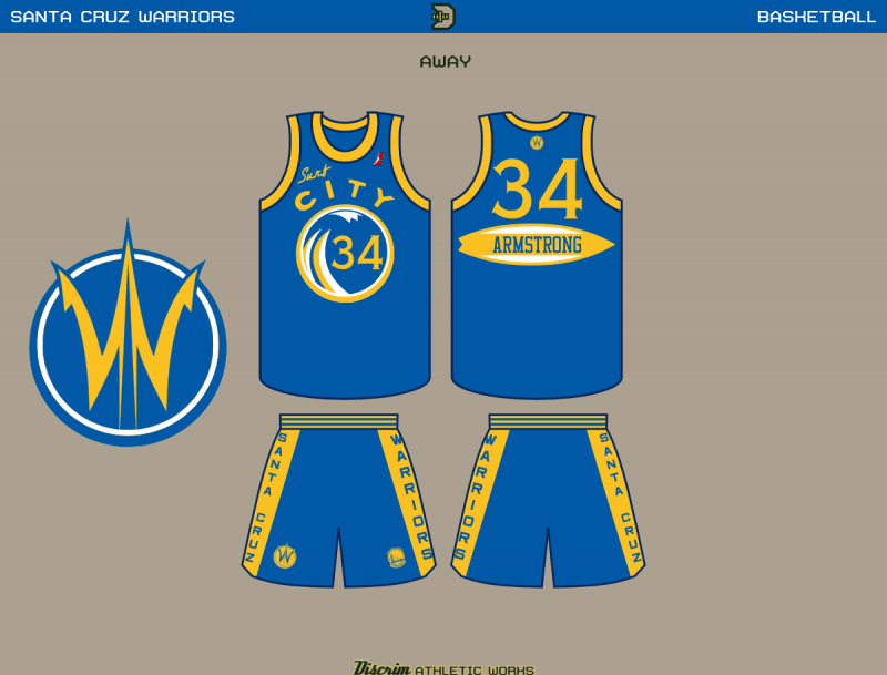
The other idea I floated out there was basically identical to the white alt, with a board as a nameplate.

Calgary Flames

A few weeks back, the Calgary Flames unveiled their new third jersey, which looks alright IMO, but the only part about it that I feel was a home run was the shoulder crest.  Getting a look at some of the rejected logos made me think the Flames missed an opportunity here, but as they say, one man's trash is another man's treasure, and the simplified burning C that was in the reject pile caught my eye.