Several years back, FS Wisconsin would show an AFL highlight show at 5 pm or so (unless the Brewers were playing out east), and I fell in love with the game after I happened to tune in one week. Unfortunately, FSW no longer airs the show, but I've been posting many an Aussie footy concept ever since. Here's some of my fare, some recent, some not so much.
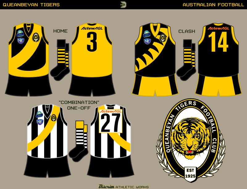
First, the only actual club among this batch, the Queanbeyan Tigers, who hail from New South Wales but are far closer to Canberra than Sydney, and thus usually play in Canberra-centric leagues. Like many "Tigers" in Aus, in real life they usually wear black jumpers with a gold sash, which is worn by the Richmond Tigers of the AFL, so here I decided on a couple different takes on it. The one-off, the sash over black and white stripes, is a throwback to the 50s, when Queanbeyan merged with another club, nearby Acton FC, which was popularly known as "the Combine," and had been wildly successful, making it to the grand final every year of the merger (which ceased due to...wait for it...money. Queanbeyan was supplying most of the players, but Acton was taking in most of the money.)
Inspired by the world of sports...I design uniform concepts as a hobby, occasionally creating original logos as well. Mostly the former though.
Saturday, June 29, 2013
Friday, June 28, 2013
College to Pro: Charles Woodson, Randy Moss, Adrian Peterson
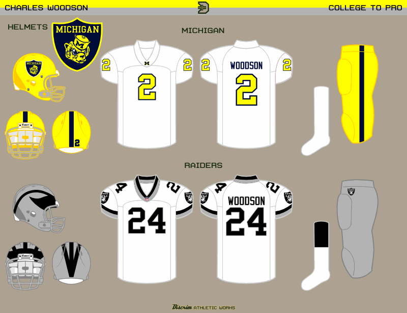
A few years back, probably even before then, I'd occasionally wondered what pro players' college and pro uniforms would look like if their overall styles, for lack of better terms, were flipped with each other. That, in essence, is the idea behind an off-and-on series I like to call "College to Pro." I've been posting sets of these for a few years now at the Sportslogos.net boards, so this aint my first rodeo, just my most recent. First up, my newest C2P concepts: Charles Woodson, commemorating his return to Oakland.
Whenever a C2P set features the Raiders as the NFL team, I've thrown together a mock Raider shield, and Michigan is no exception, though I had to do a bit of diggng for the wolverine head I used, otherwise I was ready to go with the M. And in all honesty, the numbers could just as easily have been blue instead of maize, so you can take it as a bit of artistic license on my part. On the Raiders side, the jersey is modeled after the late 90s Michigan road white, with silver and black replacing maize and blue, naturally, and the Raider shield replacing the M's on the sleeves.
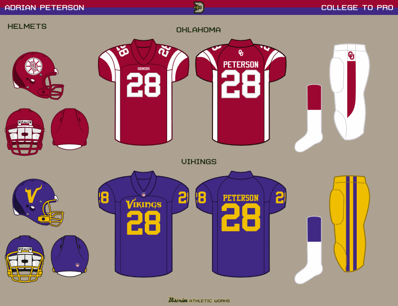
A few months earlier, I'd posted a little Vikings two-step in the form of Adrian Peterson and Randy Moss. As I've found myself saying more frequently than I do with normal concepts, some things happen, most often it'll be an issue that prevents a true swap, for instance the Vikings having their famed horns, but Oklahoma not really having anything horizontal that'd look good on a helmet (I'm sorry, that stagecoach is just ugly). Thus, the Boston Bruins ripoff meant to evoke a wagon wheel. The OU jersey is based on the recently-retired Vikings uniform, and as you can see, I had a much easier go of it making the Vikes resemble the Sooners.
Have a good weekend, and be thankful you aren't a Bucks fan. Getting swept by the Heat aint progress, no matter what Kohl thinks.
Whenever a C2P set features the Raiders as the NFL team, I've thrown together a mock Raider shield, and Michigan is no exception, though I had to do a bit of diggng for the wolverine head I used, otherwise I was ready to go with the M. And in all honesty, the numbers could just as easily have been blue instead of maize, so you can take it as a bit of artistic license on my part. On the Raiders side, the jersey is modeled after the late 90s Michigan road white, with silver and black replacing maize and blue, naturally, and the Raider shield replacing the M's on the sleeves.
A few months earlier, I'd posted a little Vikings two-step in the form of Adrian Peterson and Randy Moss. As I've found myself saying more frequently than I do with normal concepts, some things happen, most often it'll be an issue that prevents a true swap, for instance the Vikings having their famed horns, but Oklahoma not really having anything horizontal that'd look good on a helmet (I'm sorry, that stagecoach is just ugly). Thus, the Boston Bruins ripoff meant to evoke a wagon wheel. The OU jersey is based on the recently-retired Vikings uniform, and as you can see, I had a much easier go of it making the Vikes resemble the Sooners.
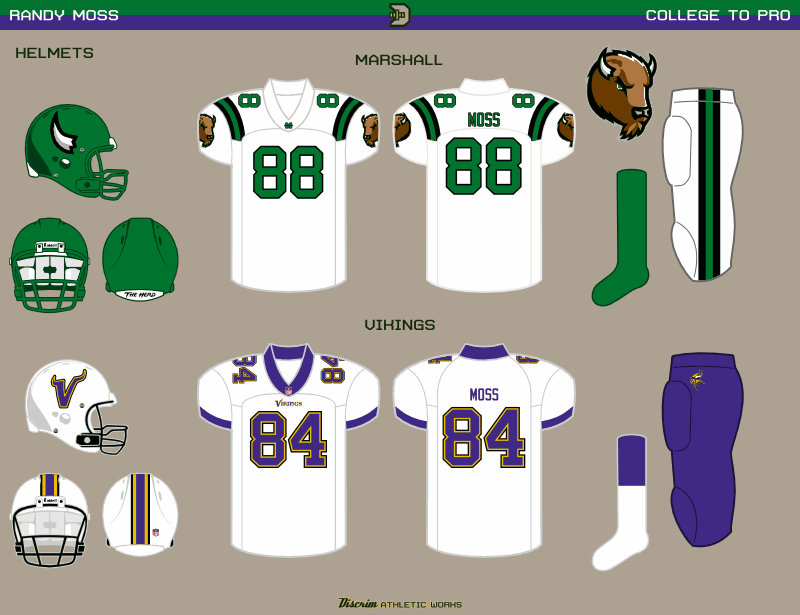
Now we got Randy Moss...and I'll tell ya what, I got childhood memories of the 1-AA championship game, of Marshall and Youngstown State duking it out, and later on, the other Adrian Peterson and Georgia Southern dominating. Fortunately for what I had in mind, Marshall's mascot is a bison (what "Thundering Herd" alludes to). Which has horns. And would be based on the Moss-era Vikings uniform, which they never should've abandoned. Granted, the bison logos Marshall uses now were adopted several years into Moss' NFL career, but there are times you gotta make excpetions. In a C2P context, I ended up calling such a case the Woodson Exception, oddly enough. The Vikings uni here, honestly, was destined to be overshadowed through no real fault of its own, merely due to Marshall's uniforms being pretty basic.

Have a good weekend, and be thankful you aren't a Bucks fan. Getting swept by the Heat aint progress, no matter what Kohl thinks.
Subscribe to:
Posts (Atom)
