Several years back, FS Wisconsin would show an AFL highlight show at 5 pm or so (unless the Brewers were playing out east), and I fell in love with the game after I happened to tune in one week. Unfortunately, FSW no longer airs the show, but I've been posting many an Aussie footy concept ever since. Here's some of my fare, some recent, some not so much.
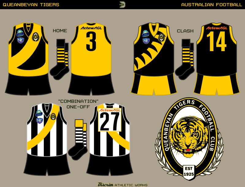
First, the only actual club among this batch, the Queanbeyan Tigers, who hail from New South Wales but are far closer to Canberra than Sydney, and thus usually play in Canberra-centric leagues. Like many "Tigers" in Aus, in real life they usually wear black jumpers with a gold sash, which is worn by the Richmond Tigers of the AFL, so here I decided on a couple different takes on it. The one-off, the sash over black and white stripes, is a throwback to the 50s, when Queanbeyan merged with another club, nearby Acton FC, which was popularly known as "the Combine," and had been wildly successful, making it to the grand final every year of the merger (which ceased due to...wait for it...money. Queanbeyan was supplying most of the players, but Acton was taking in most of the money.)
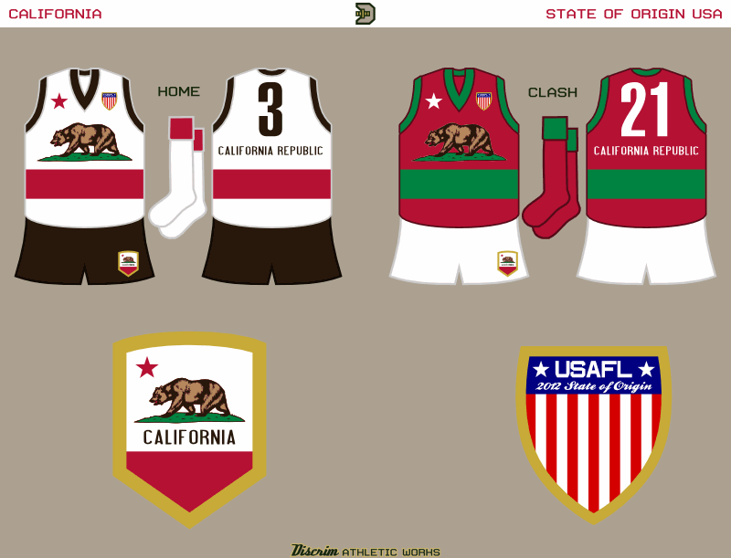
Dipping a little bit back into my archive, the next two are from an off-and-on US states project. First, California, whose flag made for an awesome jumper.
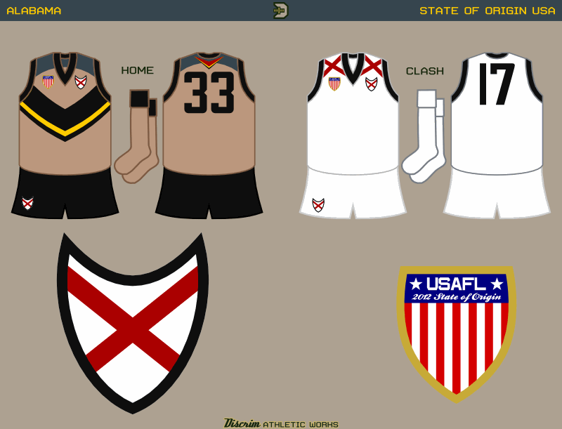
The other state jumper today represents Alabama. The home jumper was based on the plumage of the Northern Flicker, a woodpecker better known down south as the Yellowhammer. As the yellowhammer serves as Alabama's state bird, I felt it was fitting.
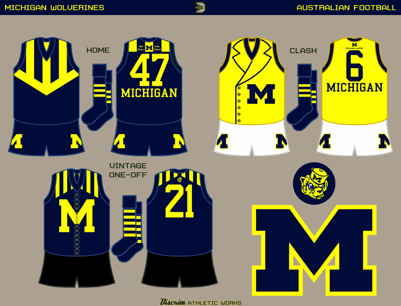
Now, some of my most recent college offerings...first up, Michigan. On the gridiron, their helmets are instantly recognizable, something I tried to capture in the home jumper through the combination of stripes and a V. The clash is based on the costume of a fella who tends to be overshadowed by fellow Green Lantern Hal Jordan: Guy Gardner, whose backstory includes some gridiron glory in the maize and blue. Finally, the throwbacks worn against Notre Dame a couple years ago was the inspiration for the vintage jumper, complete with the older M.
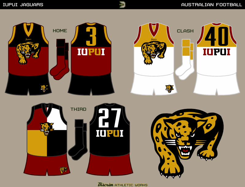
Next is one of the more obscure schools in the country, Indiana University-Purdue University at Indianapolis, better known as IUPUI. Granted, the logos I used here are their old ones, but the new logo is weak IMO. The home and clash are loosely based on the classic Fitzroy/Brisbane style, with a prowling jaguar instead of a lion, while for the third, I chose to try something I don't see that often: a harlequin style.
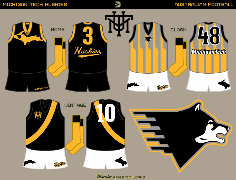
Ending this post, more obscurity from an obscure place: Upper Michigan, the home of Michigan Tech. The Huskies' athletic program is best known for hockey, and is Division II in everything else. I figured one thing, much as I like the "piano dog," in this case I wasn't sure I wanted to really highlight it here, as Upper Michigan lent itself to a more interesting first choice IMO. The clash is largely weird for its own sake, and the vintage is reminiscent of a pre-70s Richmond jumper, which had a thinner sash than what's used now...I could easily see Richmond doing something like donating old jumpers to MTU in the early 60s in an alternate universe.
Enjoy your day, and like DJ Gee-A, I'm ghost.
EDIT: huh...thought this would've posted months ago.
No comments:
Post a Comment