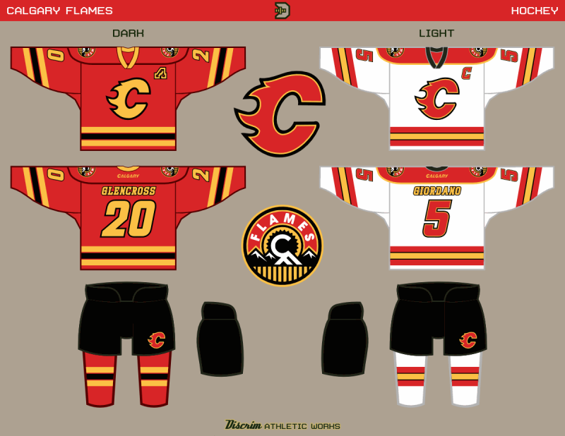
A few weeks back, the Calgary Flames unveiled their new third jersey, which looks alright IMO, but the only part about it that I feel was a home run was the shoulder crest. Getting a look at some of the rejected logos made me think the Flames missed an opportunity here, but as they say, one man's trash is another man's treasure, and the simplified burning C that was in the reject pile caught my eye.
Black's overwhelming presence on Calgary's real reds is reduced here, and gold more emphasized, though I felt in the end, a more tertiary use of black would work for the Flames. The new third's shoulder crest is promoted to the main set.
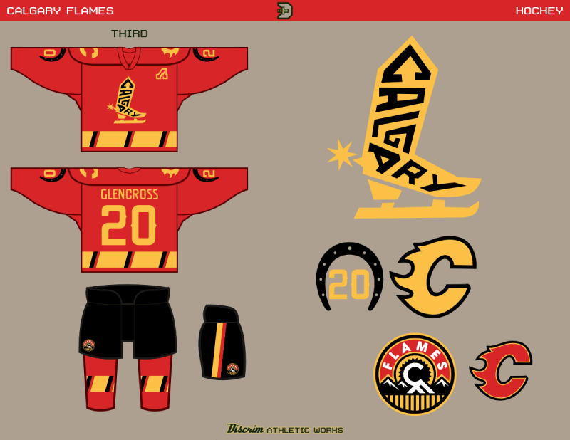
Also among the rejected logos was a cowboy boot reading CALGARY, and the first time I saw it, I felt it would make a strong crest. Combining it with another aborted idea, sleeve numbers within a horseshoe, and a small piece of my past work-vertical stripes within a broad horizontal stripe-and voila, credible third. The different number font combined with the distinct striping should differentiate the third enough from the main red.
No comments:
Post a Comment